Weight Sensitivity Chart
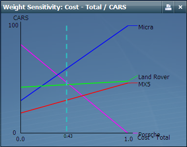
The Weight (X axis) and Score (Y axis) can be selected by the user to be any two criteria. The graph shows the effect of changes in the selected weight on scores aggregated to the selected level - this is only meaningful if the selected Score lies above the selected Weight in the criteria hierarchy. Each alternative is represented by a colored line that shows how its score on the selected criteria changes as the selected weight is changed from 0 to 1. The vertical dashed line shows the current value of the selected Weight.
To create a weight sensitivity chart click the  and then select the critera for weight and score axis in the chart.
The colors of the lines match the colors of the Alternatives in the alternative window. If a line is horizontal, it means the chosen weight has no effect on the particular Alternative's score.
A gentle slope means the chosen weight has some effect on the alternative's score (at this level in the hierarchy), but not much. (The alternative's score is not particularly sensitive to the weight).
A steep slope mean the weight has a lot of impact on the score of that alternative. (The alternative's score is very sensitive to the weight).
All aspects of the weight / scores graphs are updated as anything in the model is changed.
Where two of the alternatives' lines (the colored lines) cross it indicates that one of the alternatives gets better than the other (on this score) at the point where the weight is set at the level of the crossover.
See also:

